Architect(s): EM2N
Address: Hohlstrasse 67, ZURICH, Switzerland
Latitude/Longitude: 47.377893861737036,8.524471765136841
Photographs: Hannes Henz
A combination of several difficult circumstances formed the starting point for this project: the dramatic polarisation of the political parties for and against socio-cultural infrastructures, a building site that threatened to slip out of public control due to an open alcohol and drug scene but that was, at the same time, one of the few green spaces in this part of the city and, in addition, is a protected area.
As a response we formulated a strategic thesis for the competition:
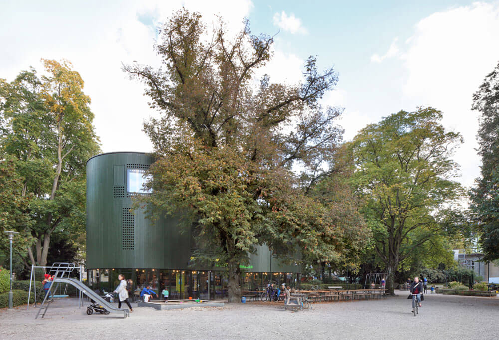
1. Not the building alone but the entire park forms the district centre! This had the consequence that the building behaves like a guest, adding an extra programme to the park.
2. All the trees are to be preserved! The building makes do with residual spaces between the root protection areas around the existing trees.
3. Minimal footprint! To use up as little as possible of the valuable park area, the building develops upwards.
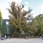
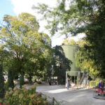
These considerations led to the stacking of the programme and to the development of a vertical prototype based on a polygonal floor plan. A camouflaging skin of standard glass and reflective glass will envelope the building and mingle with the trees – the paradox of the invisible tower.
In parliament the architectural project degenerated into an ersatz battlefield where a struggle between widely divergent political positions was fought. Finally, in a typically Swiss compromise, the budget was practically halved from 5.4 to 3.0 million Swiss Francs. The commission then was to discover what and how much could be built with the new budget. While preserving the principles formulated in the competition project, thanks to a forward-looking strategy the economic cutbacks could be transformed into a starting point for a new project. To retain sufficient critical programmatic mass in terms of urban planning, we decided to create as much floor area as possible. Although the budget was reduced by 45% the amount of usable floor area was reduced by only 25%, which meant radically cutting building costs: strategic minimalism! Consequently, all requirements and wishes were subordinated to this goal. Technical standards and all other accustomed levels of comfort were questioned and – together with the materials used for all the building elements – simplified.
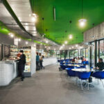
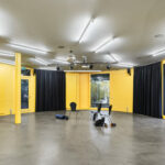
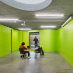
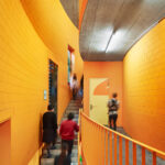
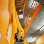
The transformation of the form and the architectural expression ultimately struck a successful, psychologically liberating blow for both friends and foes of the first project. A basic structure, enhanced at specific points, now offers space for diverse activities. The building still blends in the park by both its form and colour. Lime sand brick is the cheapest material to build curved walls. With the radical use of colour we “killed” the somewhat out-of-date material so that only colour and form remains. The outer skin appears conservative with a “British racing green” whereas the interiors shine in bright colours. The grass-green of the ground floor connects the outside with the inside and contrasts the orange staircase. Yellow and light green in the first and second floor vary the theme of botanical colours and correlate with the park depending on the seasons. Starting from the image of tree bark the façade is perforated and tattooed. A skin is generated which exceeds the image of a “Lochfassade”, creates depths and relates to the environment.
Text description provided by the architects.
Construction management: Jaeger Baumanagement GmbH, Zürich
Structural engineer: Tragwerk Bauingenieure GmbH, Affoltern a. A.
Timber construction engineer: Pirmin Jung Ingenieure für Holzbau GmbH, Rain
Contributed by EM2N

