Architect(s): Chiasmus Partners
Address: 10 Hakdong-ro 3-gil, Nonhyeon-dong, Gangnam-gu, SEOUL, South Korea
Latitude/Longitude: 37.512334436722526,127.02255413354811
Photographs: Namsun Lee
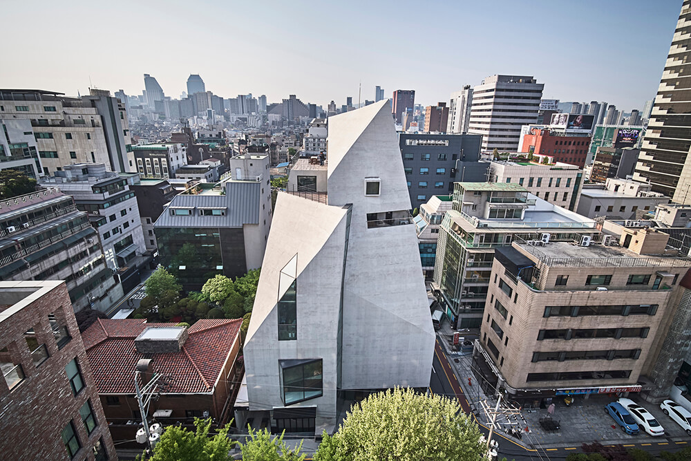
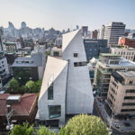
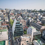
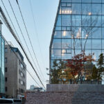
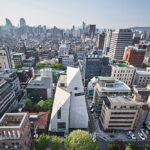
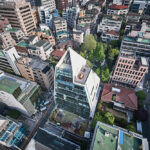
I Tower is located a few blocks from Gangnam’s business district, a symbol of modern Seoul that features a concentration of commerce, corporate and residential areas where one can find many digital design advertisement agencies. These characteristics of the location, and the emerging digital advertising brand’s demand for a ‘new type of office building’, meant that there existed a need to incorporate functional flexibility, efficiency and symbolic significance. To further illustrate the context, the site is located at a block corner and faces a small park to the north, around which there are residential buildings of three to five stories. Facing the park to the north and the business district’s high rise buildings to the south, the design needed a balance between not disrupting the neighborhood’s public space and forming a part of the urban landscape.
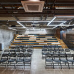
Under these circumstances, the objective of establishing a space for conferences, lectures, events and leisure for 200 employees had to be achieved in a building with a height to width ratio of 2:1.
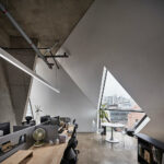
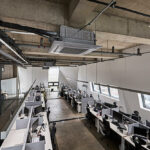
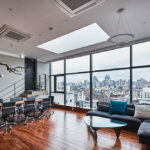
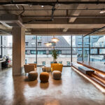
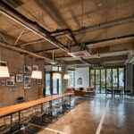
To build a comprehensive floor plan with compact core elements required establishing efficiency in space through minimizing circulation and construction costs. Given the limitations presented by the building’s elevation, the mass was established almost sculpturally but every floor plan is a square. The outer concrete envelope functions structurally like an arch, removing the need for more than one column in the interior space, further maximizing the efficiency and flexibility of the office space. A quarter of the square area in each floor plan serves the rest of the floor through the core functions of vertical circulation, bathroom and kitchen, and this service space is vertically compact at 3 meters. The rest of the floor is a big, open space at a height of 4.5 meters, and can be used not just for office work but also events, performances, exhibitions and other programs, enabling almost infinite versatility. One must recognize that such versatility in function is demanded even from architecture built for a single purpose, due to the need to adapt to the rapid changes that characterize modern society.
The building houses a parking lot at the first basement level and a 250 seat multipurpose theater at the second basement level with a separate entry. The 8 floors above ground contain open spaces that are 4 to 4.5 meters in height, and feature a total of 200 workstations, 8 conference rooms and 6 executive offices; the core contains bathrooms, elevators, stairs, storage, server rooms and resting areas in 9 floors that are 3 meters tall.
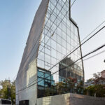
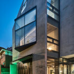
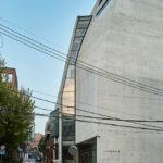
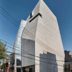
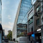
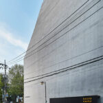
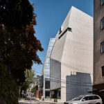
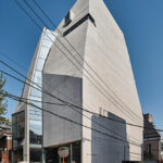
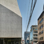
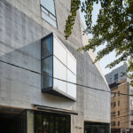
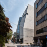
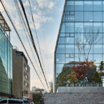
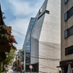
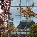
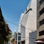
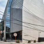
Like a sliced apple, the concrete mass’ southern face is made of glass to allow sunlight to permeate the space, and the rough contrast between the smooth glass and the rough texture of the sliced concrete expresses the mass as broken.
Although comprised of one space, the mass is divided into three parts, each of which border each other in gaps and cracks that, through projecting shapes in the ambient light, amplify the sense of fragmentation in the space and allow the mass to overcome the monotony of concrete.
This building features a design with the accuracy in function demanded in a new business, the flexibility to endure the changing times, the form to be widely recognized as a symbol for a new brand, and the harmony of sculpture and cosmopolitanism as a response to the residential and urban context. This shows that in modern architecture, functional efficiency, flexibility and symbolic form can be complements rather than contradictions.
Text description provided by the architects.
Area: 367m²
Contributed by Chiasmus Partners

