Architect(s): Atelier Kempe Thill
Address: Anton de Komplein 232, AMSTERDAM, Netherlands
Latitude/Longitude: 52.31427116841284,4.958438369490692
Photographs: Architektur-Fotografie Ulrich Schwarz
The Amsterdam-Bijlmermeer housing development, which was erected in the nineteen-seventies based on CIAM principles under the direction of Siegfried Nassuth, has been being overhauled since the mid-nineteen-nineties due to a wide range of social and structural problems. In this case, urban renewal means, above all, radically demolishing large-scale, honeycombed housing blocks and replacing them with differentiated, small-scale block development and terraced housing. At the same time, the existing shopping center is being upgraded through the addition of a wide range of new, public facilities and thus assumes superregional importance. In the northern part of the downtown area, a new market square is being constructed, surrounded by the district town hall, a swimming pool, the Bijlmer Park Theater, and the already existing police station. In addition, the established public park is being regenerated and made better connected with the district center via the square.
In 2007, within the framework of a negotiation procedure, Atelier Kempe Thill received the commission to plan a residential hotel for heroin addicts located at a sensitive transition between the square and the park. The task here was extremely delicate since such facilities are very unpopular with the population and normally have a miserable existence in container structures on the urban periphery in industrial or railway wastelands, almost never realized as a new building in the direct vicinity of central, public institutions and parks. For the architects, this posed an interesting question: How should the typology of the “Drug Addicts’ Hotel” be manifested within the urban context? On the one hand, an attempt was made to realize the building as an emancipated and consciously “publicly” designed institution in the ambivalent spatial realm between park, theater, and swimming pool. On the other hand, as a result of its sensitive user group, the building is designed as a rather anonymous, reserved structure that forms a building ensemble with the adjacent police station.
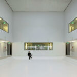
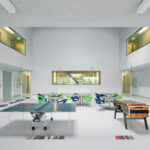
Collective living room
This residential hotel is defined by a differentiated use of space. On the one hand, “long stay” and “short stay” clients are given accommodations in the building, on the other, methadone is administered here and training and employment programs also take place within the building. With forty-five square meters per person, the living space provided is very generous and far exceeds social housing standards, which is surely remarkable from a social point of view.
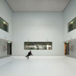
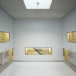
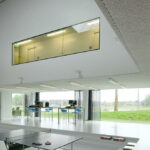
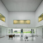
The square plot of land that was available initially, measuring twenty-five meters square, turned out to be rather unfavorable for the organization of the spatial program since the many (usually small) rooms all require direct daylight. The building is therefore organized along the property boundaries, which results in a programmatic ring in terms of layout. Very compact access in the form of an “excess pressure stairway” is positioned in the interior, meaning that a second emergency escape route is unnecessary. Within the ring, a “vacuum” for which there is no programmatic counterpart is created and interpreted as an atrium. On the ground floor, there is a large, central common room that opens up over three stories and is realized within the structure as a cube measuring nine meters on each side. The impact of the space is further enhanced by the lowering of the floor level in the atrium area, whereby its communal use is also emphasized optically. This space emerged almost “incidentally” from the logic of the plot characteristics and was not originally part of the task at all. It forms the center of the new building and, as a generous “communal living room,” can be used for various activities that contribute to the socialization of the residents.
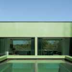
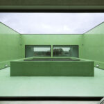
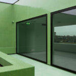
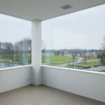
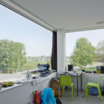
Above the atrium is a roof terrace, which is designed as an intimate and introverted courtyard. In it, the residents can withdraw and relax away from the public space.
Light and neutrality of use
The building is owned by a building society and has been rented by a foundation for a period of ten years. Yet unclear is whether the building will still be used as a “Drug Addicts’ Hotel” after 2022, or whether it should be used for other programs down the road. In order to make it possible for the owner to make simple adaptations within the structure, Atelier Kempe Thill was, for the first time, faced with the challenge of creating a structure that is truly neutral in function. The building is executed as a frame construction, with non-load-bearing interior walls and all the technical installations also integrated into the building independently of the load-bearing structure. As a result of these measures, the structure can be adapted to new uses relatively quickly and without great expense.
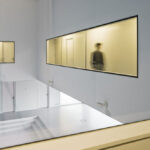
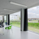
Due to its compactness and its use, it is important that a considerable amount of natural daylight is available within the building. The façade was therefore generously glazed and allows significant light to penetrate the interior. The central atrium is illuminated by a skylight and receives additional light via the façade. Space-dividing walls are often executed in glass, which gives rise to expansive visual connections within the building that are necessary for facilitating an overview and for social interaction.
Between representation and anonymity
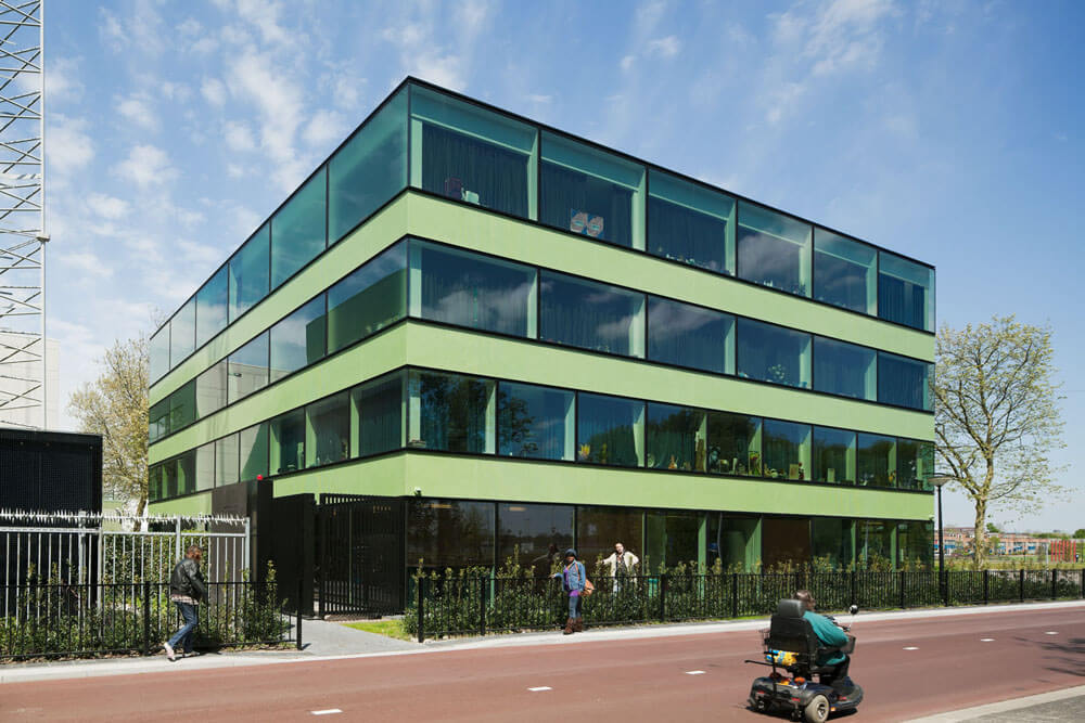
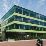
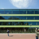
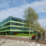
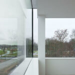
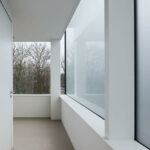
At first glance, the exterior of the building is defined by horizontal, rather neutral bands of windows with solar-control glazing. Since windows that can be opened are expressly not desired according to safety regulations, very generous fixed glazing with lengths of 2.6‚ four, and six meters – depending on the size of the room – are installed. The glass is clamped in very slim, extruded, and black-anodized aluminum profiles, which were developed specifically for this project in close cooperation with the Keers firm. In order to make this possible financially, the number of the different types of profiles was reduced to three.
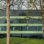
The windows are thus “pulled” over the structure and the edge of the roof “like a skin,” making the appearance of the building more abstract and elegant. At the same time, the structural skeleton framework shines through the glazing and lends the façade unusual depth. Three horizontal balustrades run between the windows. These balustrades are executed with very small, reflective glass mosaic tiles, which emphasize the slickness and hermetic quality of the façade and bring in a refined and tactile quality. The green of the glass tiles thus strives for a color reference to the glazing and to the colors of the neighboring police station. For cost reasons, the tiles were not purchased in Italy but instead specially produced for this project in China. As a whole, the façade exhibits a reserved but representative skin that obtains its effect from the proportions of the windows, their astoundingly monumental scale, and the very reduced and abstracted detailing.
In the interior of the building, the task consisted of achieving a robust and neutral choice of materials despite the tight budget framework. A decision was consciously made to use light gray, easy-to-clean surfaces in combination with a lot of glass in order to offer a calm framework for everyday life. All the walls are plastered, with the concrete surfaces in the stairway given only a transparent coating, the floors coated with polyurethane, and the ceiling executed with acoustic spray plaster. All technical installations, such as ventilation outlets, extractors, safety technology, fire dampers, and so forth, are integrated as carefully as possible into the walls and ceilings so that a monolithic character is created for the surfaces here as well. The atmosphere that thus develops is very calm and neutral, emphasizing the spaciousness of the building and offering users the opportunity to adapt the individual rooms to their own particular needs. With this undertaking, it was possible to realize a special housing construction project with a consciously public-oriented and especially refined aura, both inside and outside. Created within the limited budget framework is a very generous and relaxed living atmosphere that surely has a positive effect on the emancipation of the residents and also serves as an example in an international context.
Text description provided by the architects.
Site area: 730m²
Building size: 2.128m² gross floor area
Building volume: 25.536m³ gross volume
Atelier Kempe Thill team: André Kempe, Oliver Thill, David van Eck, Rafael Alencar Saraiva, Marcel Geerdink, Pauline Marcombe, Teun van der Meulen, Anja Mueller, Andrius Raguotis, Ruud Smeelen, Philip Stalbohm, Giorgio Terraneo, Roel van der Zeeuw
Building physics: Adviesbureau Nieman, Utrecht
Structural engineer: Ingenieursbureau Peree, Deventer
Quantity surveyor: Traject Vastgoed Advies Groep, Zevenaar
General contractor: Bouwdam, Volendam in cooperation with Van den Hogen Bouwbedrijven BV, Volendam
Contributed by Atelier Kempe Thill

