Architect(s): Alberto Apostoli Studio
Address: Via Strà, CALDIERO, Italy
Latitude/Longitude: 45.41585741396368,11.175862014343869
Photographs: Luca Morandini
With a professional experience built up in the ambit of various design projects, Alberto Apostoli has converted the historical and long‐established store of Caldiero Terme (Verona) into a space that is lively, multisensorial and packed with exciting areas played out between transparent effects and chromed reflections.
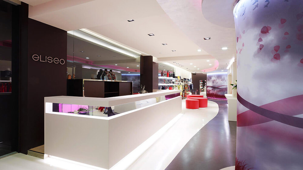
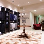
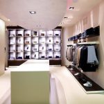
The concept underlying this project is based on a combination of creativity and rationality and evolves through a refined use of form, light and colour. Rationality is implicit in the use of squared shapes executed in glass and metal; creativity is mainly to be seen in three elliptic elements rising from the floor to model the false ceilings, thus contributing to separate the retail space into three distinct areas: menswear, ladies’ wear and young fashion. Apostoli has addressed this project by drawing on a background of “marketing and communication know‐how” that often distinguishes his work together with different skills acquired in the multi‐media sector. Important elements of emotional communication with the clientele are, for example, the back‐lit glass display cabinets, the RGB lighting of the false ceilings and the “honeycomb” display units in glass and metal. The LEDs, whose vertical and horizontal light is used by Apostoli as a proper surface covering, run all along the main aisles of the store and its furnishings, transforming the latter into sources of indirect light. All furniture pieces have been custom‐made by the architect’s own design and are defined by an unusual combination of glass and pearly white lacquered wood. A particularly impacting element is provided by the large brown wall which appears to be “boxed” inside a glass display cabinet and whose interior supplies the backdrop to the china cabinets and furniture elements composing the till area. The large display table positioned close to the entrance is particularly striking and elegant with its all‐glass structure that is partially illuminated from within. A clever use of colour has been made: coffee and beige for the resin flooring, dove grey for the furniture and sections of the flooring and, finally, red – a flash of colour that defines some graphic details, as well as a most unusual chair that has been specially created for this project.
The interior is dominated by two changing rooms created inside circular elements and upholstered in special back‐lit fabrics to create a three‐dimensional effect. A space has also been dedicated to a small bar built in stainless steel, to respond to the owner’s intent to “spoil” customers. For “L’Eliseo”, Alberto Apostoli has implemented a proper strategy of “Brand design” because, as well as handling the architecture and interior design‐related aspects, he has in fact personally followed the store’s communications strategy, including the creation of its new logo and advertising campaign. The external facade of the building has been completely transformed by applying an original surface cladding that simulates the aspect of a pearly white stone together with custom‐made recessed spot lighting. Moreover, some additional floor‐to‐ceiling windows have been created, both on the side of the building corresponding to the parking lots and adjacent to the menswear department.
Access to the store can be gained through a dark brown partition, to the right of which customers can find the main entrance door in floor‐to‐ceiling glass; whereas on the left a corner window display gives customers a “first taste” of the particular spirit of this venue. This is how the architect sums up his project: “a retail space in which the emotional impact of the space and the various architectural and technological solutions complete the exciting experience provided by the products themselves. The perception of the different spaces tends to dilate and extend the range of vision and the various scenarios, making the products on display look like truly refined and artfully showcased decorative objects”.
Text description provided by the architects.
Contributed by Alberto Apostoli Studio

