Architect(s): Chroma Studio
Address: Via Noto 10, MILAN, Italy
Latitude/Longitude: 45.43052738362304,9.199998338057473
Photographs: Riccardo Gasperoni
A modern office, linear and neutral, is converted into a home and made welcoming through a play of colours, coverings and décor. Its unique structure, consisting of a narrow corridor, was the driving force behind the design project, turning a limitation into an opportunity. The goal was to enhance the areas and multiply the spaces through optical illusions based on targeted colours, mirrors and wallpaper.
The space is transformed and divided, illuminated by large ribbon windows that fill the place with natural light. The intervention therefore aimed at enhancing the existing monochromatic and linear spaces which lent themselves adequately to a chromatic and decorative play thanks to the play of volumes already present.
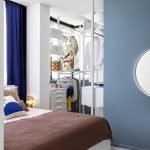
The client, a young independent girl, was looking for a place that could be practical and welcoming at the same time, the ideal home for everyday life but also versatile. By studying her personality, habits, tastes, including her favorite colours, Chroma Studio opted for a soft and harmonious palette, ranging from sage green to brick red passing through the powder blue.
The colours selected for this project shaped the rooms and increased the space, proving that even the smallest projects like this 50 sqm one-bedroom apartment can be enhanced and turned into welcoming and comfortable homes.
The colour is an excellent tool for delimiting a space, dividing it, giving it an identity. By the choice of the correct colour it is possible to create moods and feelings, and make sure that the environment we live in can influence our emotions.
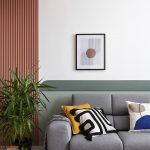
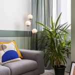
The pine green of the living room, used in two shades, expresses regeneration and rebirth, urging us to breathe more deeply and instilling trust and security. It favors blood pressure reduction by stimulating the pituitary gland, which is ideal for the living area! The palette also includes the white colour, which acts as a neutral canvas and contributes to lighten the environment by providing balance and serenity.
Colours carry with them a universal message, fruit of cultural and historical evolution; their communicative capacity is very powerful.
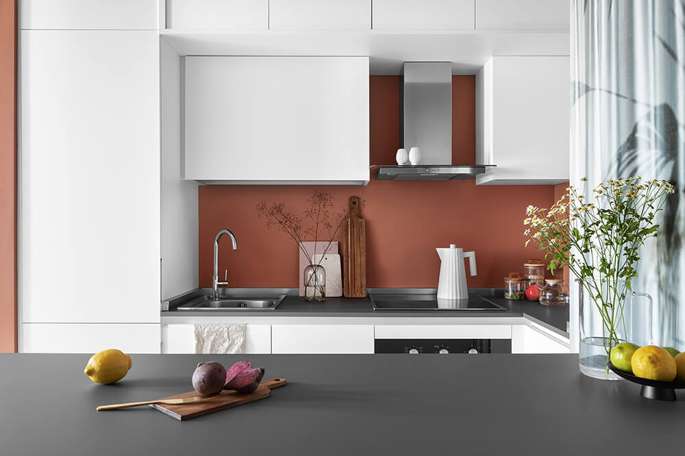
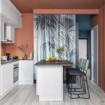
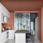
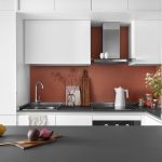
The kitchen is the heart of the house, enclosed in a chromatic “cube” that instills openness and sociability, thus generating a dynamic and multifunctional environment. It becomes the place to welcome and share, accompanied by dark chestnut wood, a colour that increases energy and stimulates the appetite.
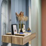
The “Elisir” wallpaper by Wall&decò, which is used right from the entrance to the kitchen, is the common thread that connects the intrinsically different environments of the house and leads the eye in the exploration of the apartment, softening the rigid lines of the narrow entrance corridor. The wallpaper decoration reproduces the design of a curtain, perfect for an irregular and discontinuous wall like that of this corridor, where it lends itself best to create the feeling of hiding another environment. Useful for making any space look bigger, ideal in a corridor.
Along with colour and wallpaper, there is another element that mixes with colour, breaking up the continuous walls with a three-dimensional play of full and empty spaces. We must never be afraid to dare, remembering that the place we live must represent us and welcome us.
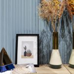
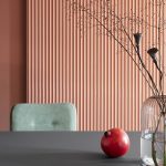
There is another element that blends with the colour and the decorations of the wallpaper, breaking the continuous walls with a three-dimensional game of solids and voids: the ribbed panel. These plaster panels consist of vertical rounded “sticks”, whose presence gives play of light and shadows ton sur ton.
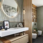
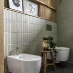
Playing with solids and voids is a very interesting method to embellish an environment. In the bathroom Chroma Studio have chosen to play with the wooden divider that, with its rectangular axes, gives an added value in terms of functionality, chromatic harmony and dynamism. The bathroom is, by choice, the most restful space of the entire apartment, a place to abandon the tensions of the day and take our time.
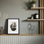
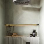
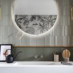
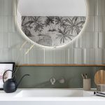
Materials, colours and textures have been chosen to help the reconnection with nature. The use of sage green infuses a feeling of balance and regeneration, associated with natural oak wood and the wallpaper “Exotic dream” by Londonart that reminds of pristine places. The design choice was to enhance the long walls of this bathroom in which one is reflected in the other. The left side holds the large fenix and oak washbasin, separated from the sanitary area through the oak divider. This wall was imagined as a sort of chessboard, where the two-dimensional enamel was associated with the three-dimensional tiles “Biscuit” from 41zero42, creating vertical and horizontal sections through the use of wood. The large circular mirror reflects the fiberglass wallpaper that occupies the entire front wall. The walk-in shower, designed as a real relaxation space, occupies the entire bottom of the room for a comfortable and pleasant use.
Text description provided by the architects.
Contributed by Chroma Studio

