Architect(s): B2Ai
Address: Nieuwstraat 13, KORTRIJK, Belgium
Latitude/Longitude: 50.82545275484862,3.2695358177833813
Photographs: Gerald Van Rafelghem
In Kortrijk, the offices of Goedkope Woning have been combined with rented homes in the social housing sector. Goedkope Woning was able to remain faithful to its objectives and vision on sustainability both with regard to residents and buildings and these ideals have also been clearly expressed in the company’s own office spaces. Maximum attention has been paid to guiding and welcoming visitors, and the employees have been given a simple and healthy working environment. The renovation was carried out with respect for the architectural features of the original building and the new comfortable city apartments – all of which are in the social housing sector – have plenty of natural light and outdoor space.
Halfway through the 1960s, the social housing development company, Goedkope Woning, rented number 13 Nieuwstraat to use as their office. Several years later, they purchased this house definitively, together with number 15, a small porter’s lodge that was part of the architectural whole.
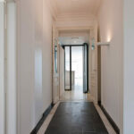
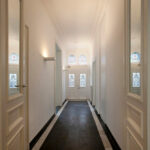
When the current director arrived at Goedkope Woning, she found the house in a rather run-down state. The sole renovation up until that point had consisted of replacing the windows, an intervention that had shown little respect for the original architectural features. Fortunately, the interior had been spared, especially on the ground floor and still had its authentic ceilings, fireplaces, and doors. The floor in the hallway and floral-patterned stained glass panel above the front door also remained intact. However, all this could scarcely be noticed, because the entire building from crammed to the rafters with archives and furniture belonging to the company. When the building was emptied, it became apparent that it would be best not to postpone several crucial renovations tasks, needed to enable employees to work in a modern way as well as to receive and help tenants in a fitting manner, for much longer.
Project definition
When defining the assignment, we realized that it would be best to incorporate the entire office on the ground floor so that employees could work together more efficiently and in order to make the office more accessible for all tenants, especially older people who were no longer as fit as they used to be. In view of the excellent location in the city centre, the other floors were then suitable for use as rented social housing apartments. With this in mind, the waste ground next to the building, was also purchased.
Architectural concept
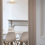
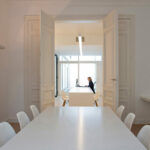
The offices with a representative function were incorporated in the ground floor of the old house, and directly connected with a new landscape office in the back. A large meeting table was placed in the spacious front room. This space will also be used as a new meeting room for the board of directors.
The room at the back, which becomes an integral part of the front room when the large door in between is opened, will be the director’s room. The small room on the street side to the left of the corridor will be furnished as a work/consultation room. It was decided to break down all the outbuildings as they were in poor condition and provided an obstacle to using the main building properly.
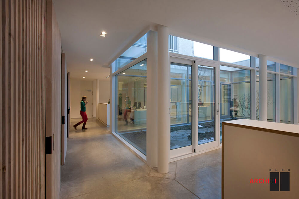
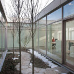
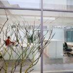
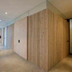
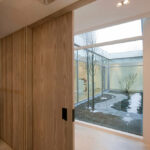
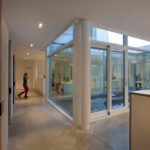
In order to design the new landscape office as a well-organised whole, all supporting services were bundled together into one entity to form an acoustic buffer between the office and the visitors’ entrance. As well as housing the kitchen, storeroom, toilets and photocopying corner, this area also includes both information counters, designed as separate consultation rooms. The uneven configuration of the wall that is shared with the adjacent furniture store was used to create extra storage space, a cloakroom and a rolling archive. The landscape office has two spacious inner courtyard gardens that bring greenery and nature to the working environment, providing it with sufficient sun and natural light. It is possible to sit and eat outside in nice weather.
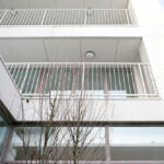
Rented social housing flats were built on the upper floors of the old house. The old open staircase was removed and replaced by a stairwell that complies with current fire brigade standards. The first floor contains a type 2/3 flat (2 bedrooms for a maximum occupancy of 3 people) and a balcony on the street side. The second floor also has a type 2/3 apartment, adapted to fit with the old building. The attic level contains a small type 1/2 apartment with a small patio at the back.
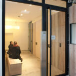
The apartments share the same entrance axis as the new offices. This entrance recedes a little from the street in order to make space for a separate bicycle shed for both the residents and employees. After office hours the gate on the street side is closed so that only residents or employees can still enter.
The house at number 15 has also been turned into social housing. In terms of social housing, it is a spacious urban dwelling with 3 bedrooms for a family of 5 (type 3/5). This house has a small garden or courtyard at the back, adjacent to the office garden.
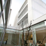
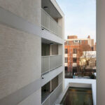
Three extra new apartments were built next to the adjacent furniture store, on the three floors above the office. The first and second floor has type 2/4 apartments which have beautiful patios at the front and/or the back. The apartment on the highest floor is a little bit smaller, type 2/3. These apartments have a separate outer stairwell that can be closed by a gate in the evening.
Use of material and interior décor philosophy
When the project was being prepared, several important principles were formulated as ambitions, the most important of which were: maximum attention for welcoming and guiding visitors; providing a simply furnished and healthy working environment for employees; renovating with respect for the architectural features of the existing building and providing comfortable city apartments in the social housing sector with plenty of natural light and outdoor space. These objectives fit within Goedkope Woning’s vision, which is to promote sustainability both with regard to residents and buildings. This vision is also clearly expressed in its own office environment.
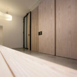
Although the open landscape office gives all employees their own workspace, it also offers them the opportunity to work together smoothly if necessary. The old furniture was replaced by spacious tables with individual worktop lighting. The interior design of the workplace is very simple: the polished concrete floor, wooden windows and practical tables and storage cupboards do not exude luxury, but tasteful efficiency. The green courtyard garden brings the seasons indoors and provides plenty of direct natural light. Noises that could disrupt concentration are limited by the acoustic ceiling. The small, enclosed consultation rooms, which in contrast to the previous situation, enable employees to help tenants with the necessary degree of privacy do not disturb the office in any way. In the entrance hall, a large information board displays regularly updated information about Goedkope Woning’s projects and social housing in general. For children, there are toys and a television that shows fun films.
When renovating the interior of the old house, the windows (which were kept like the original model in as far as possible) and all technical equipment were renewed. Everything was painted white with the exception of the restored stone floor in the hall; all the wooden floors were fitted with parquet (small wooden slats), which restored a homely atmosphere. The ceilings and fireplaces were also restored and given a new lease of life. The simple design and finishing details allow the spaciousness to predominate. All this has made it possible to avoid any form of excessiveness, something which would not sit well with the company’s social objectives. Finally, there is also a cellar which can be reached from the office.
The new house and six apartments were given a simple design and finishing details. They comply with all existing regulations, and a deliberate choice was made not to integrate a lift in the project. There must be at least 20 housing units to make such an expensive investment cost-effective.
This historical building, which is more than one hundred years old, has now been restored and put to new use. The seven new homes have given 20 residents excellent and comfortable living spaces in the heart of the city.
Text description provided by the architects.
Closed shell construction: Depret nv (principal contractor)
Interior joinery: Vanver
Mobile walls: Bruynzeel
Fixed furniture and loose furniture: Tivan and Deco Lust
Surroundings: Indoor gardens are designed by Paul Deroose
Contributed by B2ai

